Programs: We don't recommend using MS Paint to create cover artwork. Adobe Photoshop is the most professional and often used program. Corel/Jasc Paint Shop Pro is another frequently used program, and is inexpensive and easy to use for those of you who have had little or no image editing experience. A third program, and one that is not commonly used to make cover art but should be mentioned (creativity is a key to great artwork), is Corel Bryce, a 3D rendering program, and Draw, which is a program closer to Adobe Photoshop.
Sizes: The sizes for 150 DPI cover artwork are as follows:
Front/Inside cover: 720x713 pixels @ 150 resolution
Booklet: 1440x713 pixels @ 150 resolution
CD/DVD label: 717x717 pixels @ 150 resolution
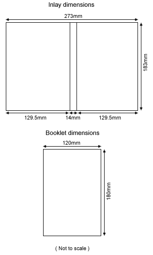
Inlay/Back cover: 924x732 pixels @ 150 resolution (spines are 39 pixels wide each)
DVD cover: 1650x1116 pixels @ 150 resolution (spine is 88 pixels wide)
Be sure to use Save As and NOT Save For Web. The following image is also useful in determining the sizes for DVD cover artwork:

For 300 DPI cover artwork, this site has downloads of PSD templates which I highly recommend using if you're into making high resolution covers. The only drawback of these 300 DPI covers is that they're huge and it's extremely difficult to find high resolution photos and artwork to use. I recommend trying this only for special projects and otherwise using one of the methods mentioned above. Be sure to use Save As and NOT Save For Web.
Pictures/Artwork: Most people prefer to use covers that have pics from that particular show, especially if they were at the show. Being at a live concert is an awesome experience and people like to feel that in the cover adorning their bootlegs. However, the greatest cover art is that which utilizes live pics with art in harmony. It is both powerful and artistic. As far as finding photos to use for artwork is concerned, here's what I can tell you: look for photos on the band's official website and/or search Google. You can also search Google for band logos.
Text: Text should be legible. That's actually a problem when a cover is printed, as most people do not have high resolution printers. Text should be of a contrasting color of the background, or have a shadow or stroke effect directly behind it to make it stand out. Text should also be large enough to read, keeping in mind that most covers get resized to a certain degree when printed so your already small text may end up even smaller, and then how is one supposed to read it if it doesn't stand out from the background like I previously mentioned? You can find a list of links to sites with band and other fonts on our Fonts page.
Track lists: What's the difference between a Track list and a setlist you ask? A setlist is a list of all the songs and jams that were played at a show. A Track list is a list of tracks according to the bootleg and how it's split. This point is often confused. When making a cover you should always check the Track list and write it according to what it is on the bootleg, not the setlist. If a cover displays the setlist, but the bootleg's tracks are listed differently, you will not be able to look up what number is what song and then the entire reason for making cover art is contradicted. You can sometimes find setlists for shows on bands' official websites, and you can sometimes frind Track lists on bootleg traders' sites.
File Formats & Sizes: It is best that you save your final draft of cover art in JPG format, as this is a compressed format that is easily downloadable and compatible with older computers and slower internet connections. To save your file while you're still working on it without any loss of quality, I would recommend saving it in PSD format, as this format can be interchanged between Adobe, Jasc, and Corel software and allows the use of layers.
Credit: I would not recommend filling half your cover with a logo or text crediting you, the creator. Logos are perfectly acceptable, and should be on a cover to give you credit (unless you don't particularly care), but no one wants to use a cover that is ruined by a distracting or annoying logo. Try to use a small pic or text at the bottom or other edge of the back cover, just like on a CD cover released by a record company. People don't mind these and your cover is then less likely to be edited by someone who doesn't care whether you receive credit or not.
Filenames: You could call your cover shit.jpg, however, it would make it easier if people would name their files in this format. This method of filenaming is most helpful to the BootlegCoverArt.com staff when maintaining the gallery. You see, the search function for cover artwork is dependent upon the filename having the date in YYYY-MM-DD format (for example: 2003-06-11) and if the cover is not a .jpg file the gallery can't create thumbnails for it.
It takes patience, practice, and creativity to make great artwork of any kind.
Written by: Harmony Havoc


