Working with Photos in Cover Art
Photographs, screen shots and other types of pictures are used in Cover Art in various ways. Boarders are put around them to be used as snap shots. Pictures are enlarged and used very effectively as a background. They are run through a series of filters to distort and change their appearance. Images within a photo can be extracted and placed into a different background. Images can be blended together to make a new image. The possibilities are endless. As this thread develops, the various techniques, tips and tricks MetCoverArtists use to manipulate and utilize photographs will be discussed.
The most important thing to remember when adding images to your cover art is to think composition to avoid the cut and paste look.
If you see a picture used in a cover that you are not sure how to duplicate the process to create a similar effect, please post a request in the Sticky above. Thanks.

Working with Photos used in Cover Art
Started by Harmony Havoc, Sep 04 2006 02:16 AM
1 reply to this topic
#2

Posted 04 September 2006 - 02:49 AM
Snap Shot Type Images
Snap shot type photos and screen shots used in cover art are one of the most commonly used techniques. Sometimes they are just cut out and placed in the composition. Other artists prefer to place boarders around them giving them a real snap shot effect.
There are several ways to create a boarder around a photo.
1. Boarders Created Using the Line Tool
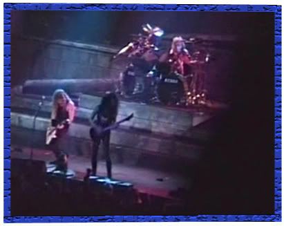
To create this effect use the Line Tool found in the drop down menu by right clicking on the Rectangle Tool found on the Toolbar.
The color of the line is by default the foreground color. Be sure to chose the foreground color before selecting the Line Tool. The thickness of the line to be used on the boarder is controlled by the weight pixel size found on the Option Bar at the top of the PhotoShop workspace. This can be changed once the Line Tool has been selected.
Using the mouse, place the curser on one edge of the picture you are using and draw the boarder across the top of the picture. Repeat this process along the two sides and the bottom of the picture, overlapping the edges carefully to make a clean looking boarder.
For a more detalied account on how to make a Frame for pictures follow the directions found in this Tutorial.
2. Boarders Created Using the Rectangle Tool
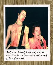
Create this effect by using the Rectangle Tool found on the Toolbar.
The color of the shape to be created is by default the foreground color. Be sure to chose the foreground color before selecting the rectangle tool.
Using the mouse place the curser just beyond one corner of the picture and draw the shape to be slightly larger than the picture a boarder is being created for. Use the Layer Pallet to place the shape behind the picture. Once the shape has be rasterized it can be cropped or sized to adjust it's size if necessary. The two layers can be locked together so they can be moved around the cover being made as one unit.
3. Boarder Created Using the Stroke Blending Option
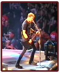
Create this effect by using the Blending Options. Double click on the pictures layer in the Layer Pallet to open the Blending Options. Double Click on the Stroke Option. Choose the stroke size to make the boader as thicker or thinner. Choose the stroke color and click "OK" and the boarder is complete.
Snap shot type photos and screen shots used in cover art are one of the most commonly used techniques. Sometimes they are just cut out and placed in the composition. Other artists prefer to place boarders around them giving them a real snap shot effect.
There are several ways to create a boarder around a photo.
1. Boarders Created Using the Line Tool

To create this effect use the Line Tool found in the drop down menu by right clicking on the Rectangle Tool found on the Toolbar.
The color of the line is by default the foreground color. Be sure to chose the foreground color before selecting the Line Tool. The thickness of the line to be used on the boarder is controlled by the weight pixel size found on the Option Bar at the top of the PhotoShop workspace. This can be changed once the Line Tool has been selected.
Using the mouse, place the curser on one edge of the picture you are using and draw the boarder across the top of the picture. Repeat this process along the two sides and the bottom of the picture, overlapping the edges carefully to make a clean looking boarder.
For a more detalied account on how to make a Frame for pictures follow the directions found in this Tutorial.
2. Boarders Created Using the Rectangle Tool

Create this effect by using the Rectangle Tool found on the Toolbar.
The color of the shape to be created is by default the foreground color. Be sure to chose the foreground color before selecting the rectangle tool.
Using the mouse place the curser just beyond one corner of the picture and draw the shape to be slightly larger than the picture a boarder is being created for. Use the Layer Pallet to place the shape behind the picture. Once the shape has be rasterized it can be cropped or sized to adjust it's size if necessary. The two layers can be locked together so they can be moved around the cover being made as one unit.
3. Boarder Created Using the Stroke Blending Option

Create this effect by using the Blending Options. Double click on the pictures layer in the Layer Pallet to open the Blending Options. Double Click on the Stroke Option. Choose the stroke size to make the boader as thicker or thinner. Choose the stroke color and click "OK" and the boarder is complete.
1 user(s) are reading this topic
0 members, 0 guests, 0 anonymous users
-
ClaudeBot (1)


